
A 0-to-1 product,
a 0-to-1 design system,
one designer.
↓
ROLE
Principal UX Designer
Design System Architect
User Researcher
Prototype
TEAM
1 Principal Designer
2 Engineers (FE + Full Stack)
1 Head of Product
5 Stakeholders
TOOLS
Figma, Figjam
ShadCN, Tailwind
Storybook
Jira, Confluence
TIMELINE
14 Months
March 2025 — Present
Testimonials
"[PLACEHOLDER — ~50 words from Head of Product on the shift from Excel to a real platform.]"
- Head of Product @ NMC²
"[PLACEHOLDER — ~50 words from an engineer on shipping from tokens and Storybook.]"
- Front-End Engineer @ NMC²
The Brief
"Our portfolio analytics team runs on Excel. Reports get built by hand, scenarios take hours, and the whole system depends on one person's memory. Build the platform that replaces the spreadsheet.”
The Solution + My Role at a Glance
At NMC², I joined as the first and only designer on Project Alpha — the internal codename for the Portfolio Management Solution.
My job was to take a tool that lived in spreadsheets and turn it into a platform the analytics team and senior leadership could trust with the firm's investment decisions. The goal? A purpose-built system, builton a design system that didn't exist yet. I partnered with two engineers and a Head of Product, shadowed the analytics team's super-user, ran discovery, anddesigned every section of the product end-to-end — from the Portfolio Manager and Asset List to Westlawn, Ventures, and Market Risk. To make the work scale, I also architected NMC²'s design system from scratch — semantic tokens, a Shadcn-aligned Figma library, a Tailwind theme, and a Storybook handoff. In the end, the product and the system shipped together, because neither could exist without the other.
Research
Dont Design. Just watch.
I started by shadowing the analytics team's super-user — the person whose Excel models produced the reports leadership actually used to make calls. My goal was to understand the workflow before I touched the interface, because anything I designed before that would be a redesign of the screen, not the job.
[Image strip: three screenshots — Excel scenario model, a PDF report, a dashboard the team was working around.]
To get a clearer picture of what wasn't working, I went straight to the source: the analytics team and the portfolio
super-user.
What I Did:
Workflow Shadowing — Sat beside the super-user for weeks, watching him run "what if" scenarios across tabs, spreadsheets, and PDFs.
Stakeholder Interviews — Met with the Head of Product, engineers, and adjacent teams to map dependencies and data sources.
Discovery Interview — Ran a formal interview session, documented in Confluence, to capture tooling inefficiencies, workflow gaps, and desired improvements.
Artifact Review — Reviewed the Product Charter, existing spreadsheets, and the conceptual frameworks the team already used informally.
What I Learned:
The workflow was encoded in one person's head. That wasn't sustainable.
"What if" scenarios drove the most important decisions — and were the most painful to produce.
The team had an intuitive mental model of their portfolios that no existing tool actually reflected.
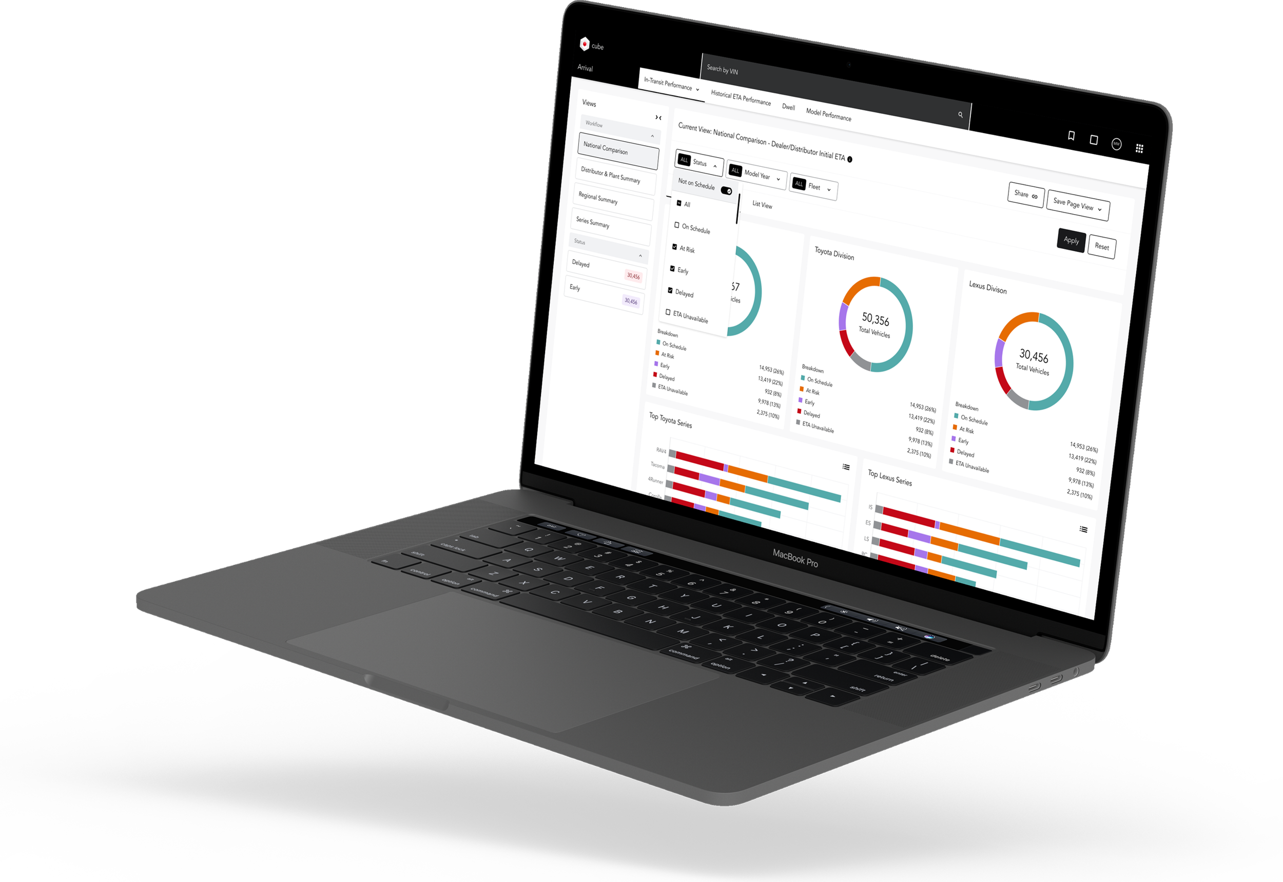
Problems
To redesign Toyota’s PCPS system the right way, I needed to understand exactly how people were using it — and where it was slowing them down. I spent time with stakeholders and key operations and pricing managers, running workshops to uncover their workflows, daily challenges, and frustrations with the current system.
Beyond conversations, I got hands-on with the system itself, exploring its tools in real-world scenarios to identify breakdowns. This deep dive helped me connect the dots between user pain points and underlying system issues.
Through this research, three major problems stood out — problems that became the driving force behind the redesign.
The PCPS system lagged behind user expectations, causing frustrating delays in pricing and supply decisions.
1. Slow
The outdated design and functionality made everyday tasks harder than they needed to be.
2. Dated
A complex, cluttered interface forced users to dig through menus just to complete simple tasks.
3. Cluttered
User Journey
I met with the team regularly to confirm my learnings — mapped workflows for pricing updates, supply adjustments, KPI’s, data usage, and vehicle configuration processes, identifying critical bottlenecks that slowed decision-making.
Data Flow Delays: Pricing and supply data were siloed, forcing users to cross-check multiple sources, leading to inefficiencies.
Cumbersome Navigation: Users had to navigate through multiple layers of menus to access essential tools, creating unnecessary friction.
Lack of Real-Time Visibility: Slow system responses and outdated status indicators caused delays in approvals and adjustments.
These insights highlighted where the system was breaking down, guiding the redesign toward what could be a more automated experience.
User Personas
Based on user interviews and workflow analysis, we developed four key personas representing the diverse roles relying on the PCPS system. Each persona captured distinct goals, challenges, and frustrations—whether it was slow system performance causing delays, outdated design leading to inefficiencies, or a cluttered interface making navigation difficult. This comprehensive approach ensured that our redesign addressed the most pressing user needs while accommodating the varying demands of each role.


Ideation
How might we make PCPS fast, modern, and relevant?
The new PCPS must acheive these goals in order to be considered successful:
Slow →
Fast
The redesigned PCPS system should deliver a significantly faster experience by optimizing system performance and reducing the lag that slows down critical pricing and supply decisions.
Dated →
Modern
The interface should be updated with a clean, modern design that aligns with contemporary enterprise tools, making navigation and daily tasks more efficient and user-friendly.
Relevant
Cluttered →
The new system should simplify workflows by reducing unnecessary complexity, making key tools and data more accessible, and streamlining the interface to enhance usability.
Lo-fi Designs + Napkin Sketches
This is where the fun begins! ~ I began with quick sketches and low-fidelity mockups to refine navigation and improve the overall flow. I developed a scalable, high-performing design system based on Toyota's Carbon library. After multiple iterations, we arrived at a layout that felt intuitive and worked seamlessly for users.


Design
Final Designs Gallery
After extensive research and collaboration, my efforts toward Toyota’s PCPS system redesign improved overall user experience, streamlined workflows, and set the foundation for ongoing improvements; empowering the team to make key system updates moving forward.
Reflection
Bringing It All Together
This project was a huge learning experience for me. While I had previous exposure to design systems, I was amazed by the complexity and intricacies of Toyota's supply chain, especially working in an environment with so many moving parts and a product being released on a global scale.
Throughout the process, we adapted the existing Carbon library from IBM, which replaced their outdated design system. I learned that this kind of large-scale system demands more than just usability; it requires deep, thoughtful iteration and the ability to adapt to a dynamic and evolving environment.
Some of my biggest takeaways from the project were:
Embrace failure as part of the process – The only way to learn and grow is by diving into the work, even when things don't go as planned. Failure isn't something to fear—it's a key part of getting better.
Iteration is key – In a project this complex, it's normal to look back at early work and think, "What was I thinking?" Over time, designs evolve, and that’s completely fine. The goal is constant refinement.
Design for others, not yourself – In the end, this system is for the users—stakeholders, internal teams, and end customers. It's about making their work easier, so I made sure to do plenty of A/B testing, usability testing, accessibility evaluations (AA/AAA standards), and conducted stakeholder reviews to validate my designs. Their feedback was crucial to creating something that truly met their needs.